UX Writing Challenge (continued)
14 days
How I feel
Almost half way there! By now, it is supposed to be the end of the challenge but it took me longer. There are breaks in between, many birthdays to celebrate, visit to make, outside of design life to take care of.
But I am loving this UX writing tasks. It pushes one to think alittle more, try something new, just do it and see how things unfold. At the end of the day, I looked back at the tasks and thought of ways that can be written better. Because of these tasks, I explored openpeeps which is a comic which can be used for storyboard. Love how one thing leads to another :)
Day 6
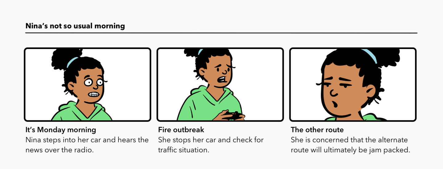
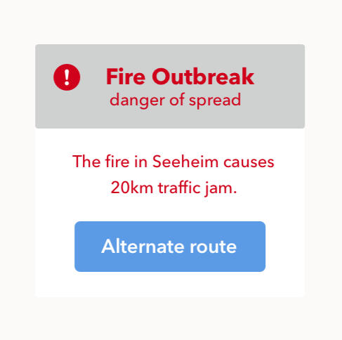
Scenario: It’s Monday. A user has just gotten into their car to drive to work. They plug their phone into the car and start driving.Challenge: How would you let the user know there’s a fire happening in a nearby town that is causing road closures? The effect on their commute is unknown, but there is a definite danger if the fire gets closer. How do you communicate this to them? When? Write it.Headline: 30 characters max
Body: 45 characters max
Assumption
- Nina's commute route maybe going towards the same highway.
- She does not need to use car navigation due to familiarity of the route to office.
- She hears the news over the radio, stops the car and turns on the navigation for traffic situation.
- Nina also uses the google map to compare traffic situation and decide for alternate route to office.As the number of characters expected is limited, the choice of wordings speak volume of a dangerous incident. Informing the user of the heavy traffic situation with alternate route would suggest user to divert to another choice of route. User can decide on the course of action when she checks the navigation.
Day 7
Scenario: A sports fan is at a wedding while their favourite team is playing against their arch-rivals. Their team scores.Challenge: How would you, quickly, let the sports fan know about the latest play, the current score, and the key players? Write it.Headline: 30 characters max
Body: 45 characters max

Images from openpeeps and illustration by Paola Delucca
Aim to make this steps quick and easy.AssumptionUser plans ahead prior to the wedding event to get specific game score notification.Step 1: User picks their favourite team. The display will show the teams they will be playing with.Step 2: User can check the matches (or rivals) they are interested to follow. The date and time of each match will be visible.Step 3: This is shown now in the image - get notification for the matches, the playing team as well as the live scores to the mobile.And expect the yay and the nay at the wedding event.
Day 8
Scenario: The user is a casual music fan and (on occasion) goes to live concerts. They have a music player app on their phone.Challenge: Tell the user that one of their favourite bands is playing live in their town. How would you compel them to want to go?Headline: 30 characters max
Body: 45 characters max
Button: 25 characters
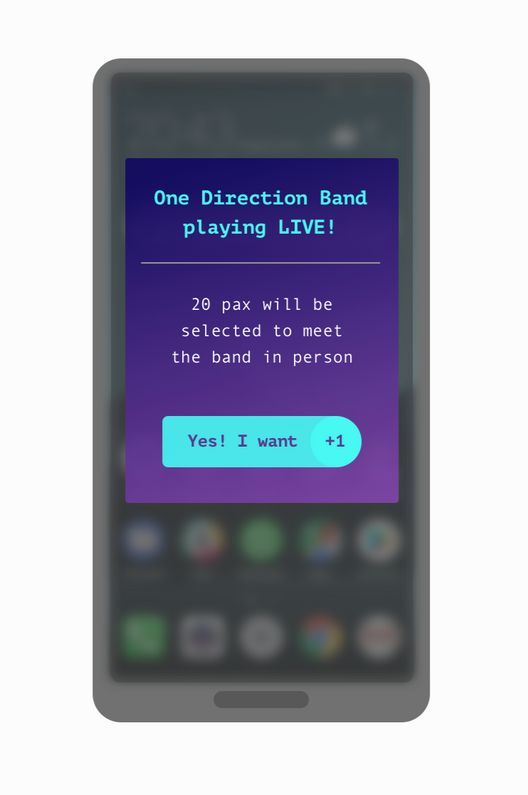
Headline:
Mentioning the name of user's favourite band playing LIVE will catch the attention.
Unfortunately there is not enough character left to add in the location.Body:
Everyone who goes to the LIVE concern would love to be in the front row and get as close as possible to feel the beat of the live performance. So why not intrigue the user to meet their favourite band in person? This would be better than any free gifts.Button:
Instead of the normal button with text, I added an element here using +1 to make it look like a counter to get the feeling of being included into the selection.Round up, I hope the galaxy colour theme would capture enough interest as well.
Day 9
Scenario: The user is trying to rent a car using an application but the credit card on file has expired.Challenge: Write them an error message so that they can correct the problem.Headline: 30 characters
Body: 45 characters
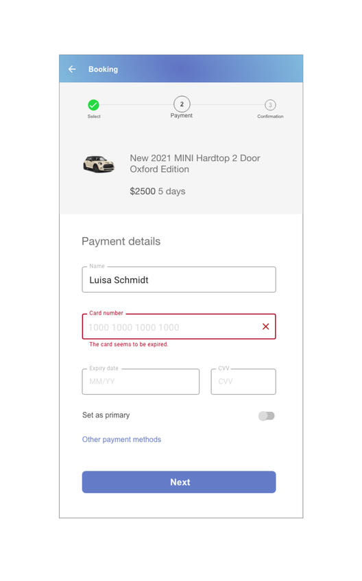
Progressive in 3 stepsAssumptionUser is making a booking for the first time. User can click on the selection in this view to edit or make changes to the selection.Step 1: User selected the choice of vehicle, was informed of the cost and proceed to next step. When this step is done, a checked symbol appeared.Step 2: User tried to input the credit card 16 digits and was prompt of the expired number with symbol. At this point of time, user can either input a new credit card number or click on "other payment method" below.Step 3: When everything is in place, the last step would show an overview of the booking when user can review and proceed with confirmation.
Day 10
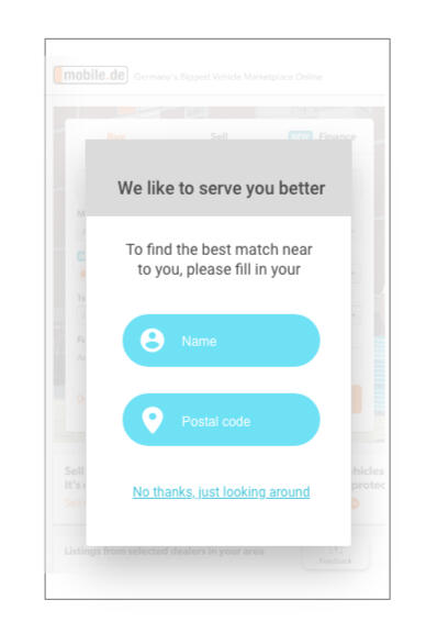
Scenario: The user is trying to view a website to help them buy a car. But, the content can’t load without the user’s location. They need to enter their ZIP code and first name.Challenge: Ask them where they live and who they are without sounding like you're unnecessarily mining their data.Headline: 25 characters
Body: 45 characters
Button: 15 characters*